
Matching colors can refer to finding colors that complement or harmonize with one another. Here are some tips on how to match colors:
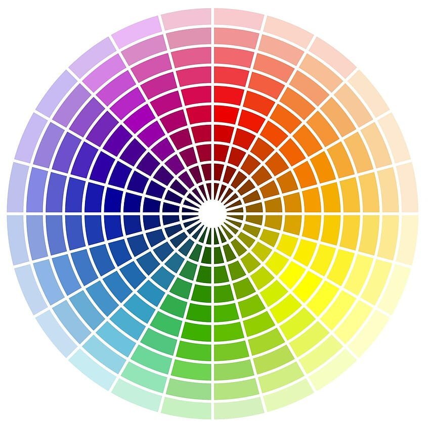
Use a color wheel: A color wheel is a tool that shows how colors relate together. Complementary colors are opposite each other on the wheel and can be used to create a high-contrast look. Analogous using colors are next to each other on the wheel and create a harmonious look.
Stick to a color palette: Choose a few colors and stick to them. It can create a cohesive and polished look. For example, if you're working with blues, choose shades in the same family, such as navy, sky blue, and baby blue.
Consider the context: Consider the environment in which colors will operate. Consider the mood you want to create and the purpose of the design. For example, bright colors might be appropriate for a children's product, while muted colors might be more appropriate for a professional setting.
Experiment: Don't be afraid to try different combinations of colors. Sometimes unexpected combinations can work well together.
Remember that color is subjective, and what looks good to one person might not look good to another. The most important thing is the colors you choose reflect the message or mood you want to convey.
Ton sur ton is a French term that means "tone on tone" or "shade on shade." It is a styling technique that involves wearing or decorating with different shades of the same color. Here are some tips on how to use "ton sur ton":
Choose your base color: Start with a color that you want to use as your base. This color should be a shade you love and looks good on your project.
Mix different shades: Once you have chosen your base color, start mixing different shades of the same color. For example, if you chose blue as your base color, you could mix navy blue, baby blue, and turquoise.
Use different textures: Another way to add depth and interest to your ton sur ton look is by using different textures. For example, you could wear a cotton shirt with a wool skirt; or use a velvet cushion on a linen sofa.
Add a pop of contrast: While ton sur ton is all about using the same color family, adding a discrepancy can create a more distinctive look. For example, if you wear a ton sur ton blue outfit, you could add a pop of red to your shoes or accessories.
Adent to proportions: When using ton sur ton, it is a decisive factor to get attention to proportions. If you are wearing different shades of the same color, make sure that the pieces are not too similar in color or texture, as this can create a flat appearance result.
Remember that ton sur ton is a versatile technique used in fashion, interior design, and graphic design. It's a great way to create a sophisticated, cohesive look with a single-color family. make